
Global
Brand
Refresh
Brand
Refresh
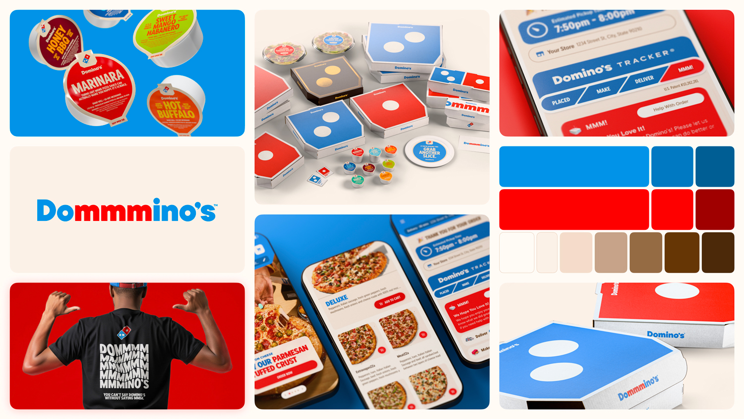
In the 13 years since Domino’s last brand refresh, the media landscape had completely shifted towards social and digital-first experiences and a plethora of new channels and mediums.
As a result, Domino’s look and feel had not aged well. So in 2025, while other brands were reinventing themselves from a point of weakness, Domino’s set out to do so from a position of strength, with the goal of making every aspect of the brand as craveable as the pizza itself.
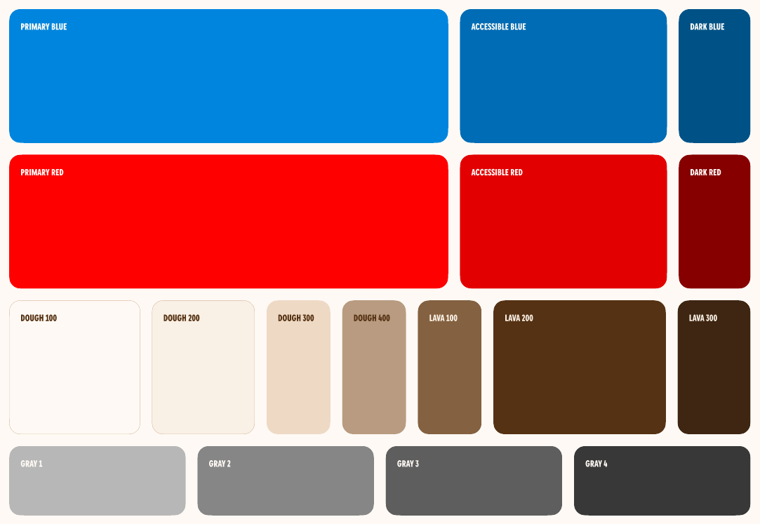

Hotter Color Palette
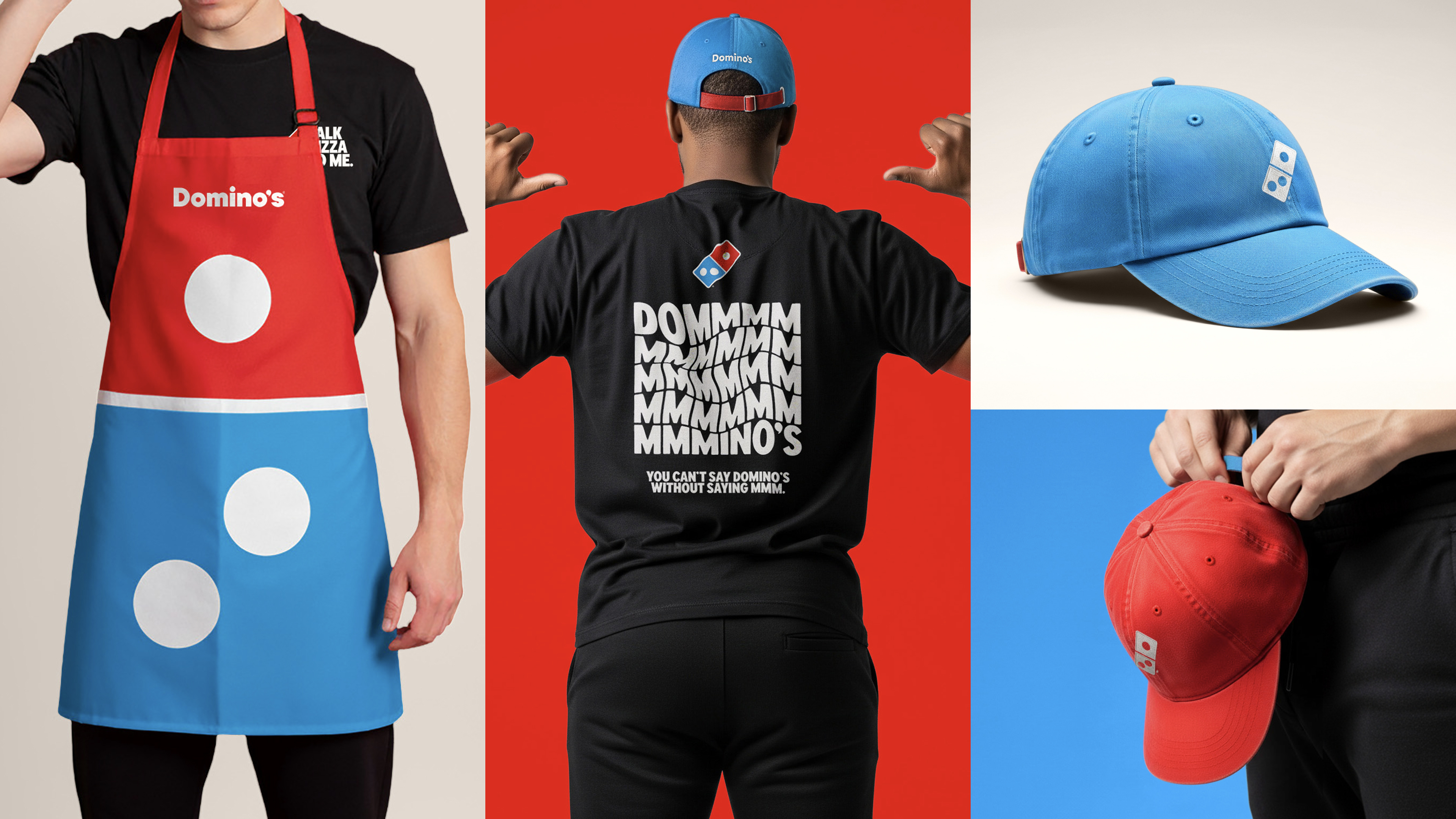
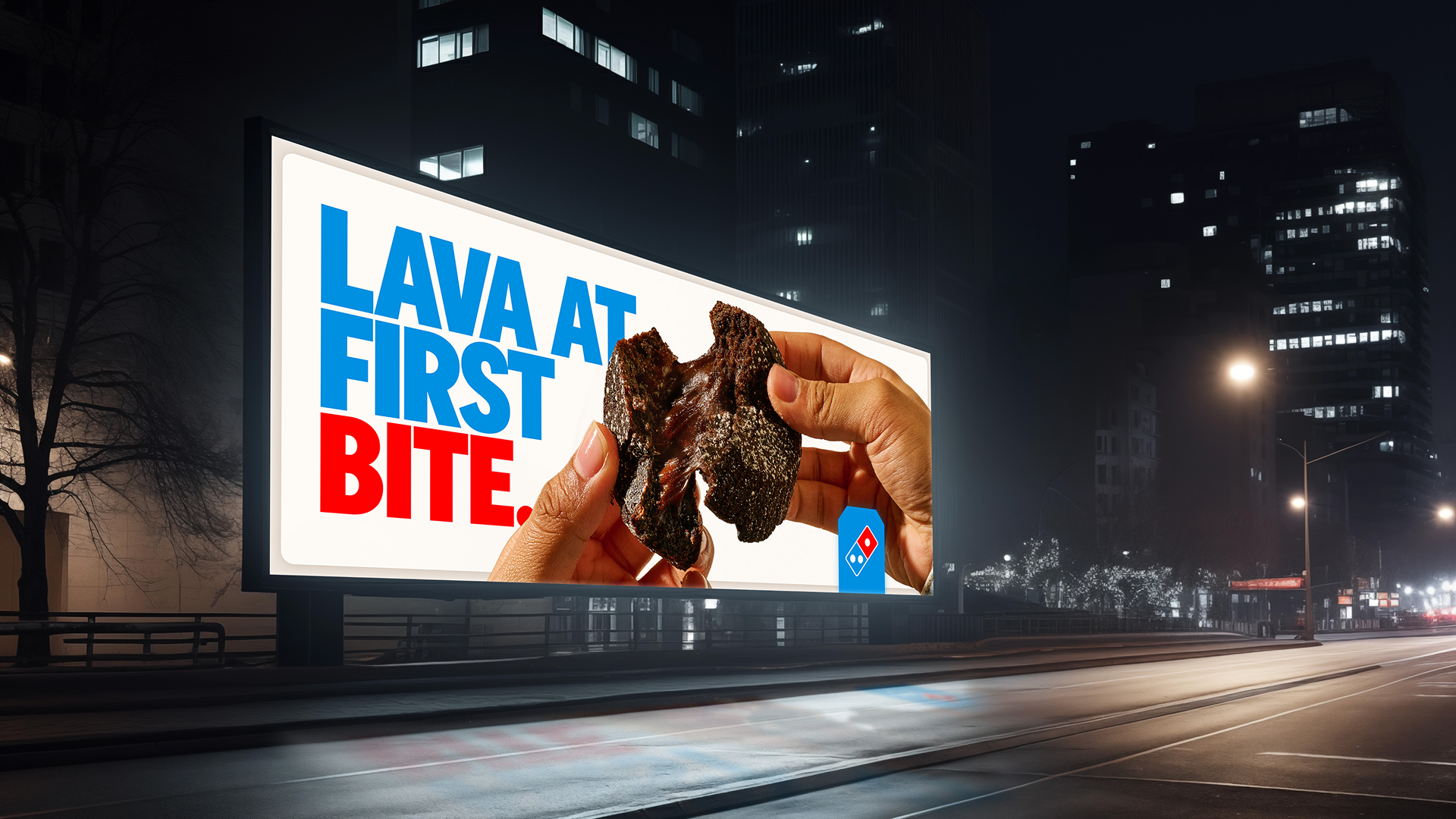
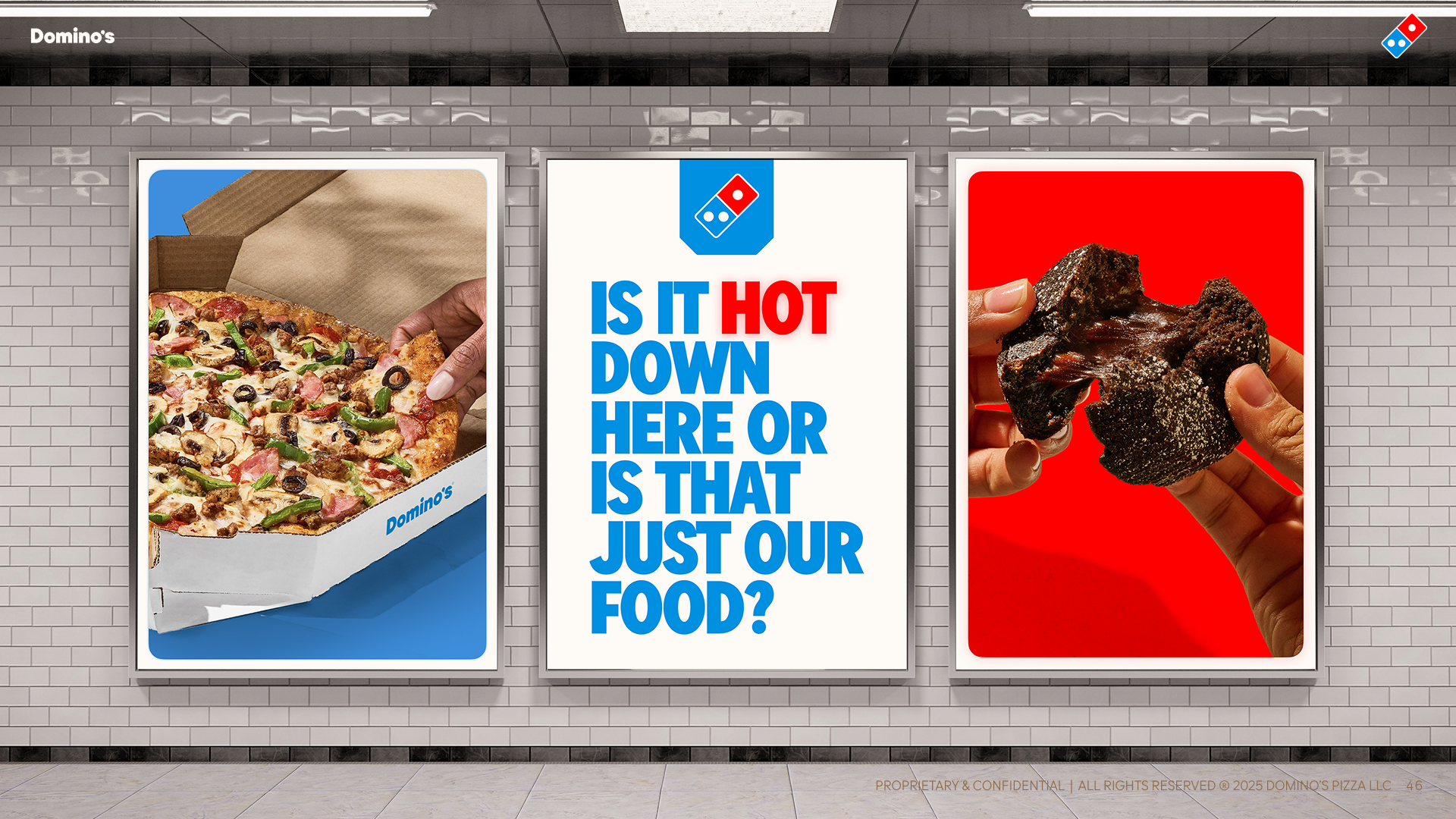
To start, we shifted the core brand colors to be the hottest red and blue we could find, that when paired together, created a vibrancy that literally felt hot. Even the shade of blue was inspired by the hottest part of a flame. Softer whites were used, browns replaced black, and dough tones were introduced.
A New, Bolder Typeface
A fully customized typeface—Domino’s Sans—was created to feel bold yet approachable, and to simplify lockups from OOH to TV, Ecommerce to Social.


Wordmark > Cravemark
Domino’s wordmark was updated to reflect the new typeface, and even to inject pizza/slice geometry right into the design.

Then, rather than bolt on a tagline, Domino’s created a new audio and visual expression we called a “Cravemark” that bakes deliciousness (or “mmm”) directly into the brand name itself: Dommmino’s. And brought it to life in partnership with Grammy-nominated artist Shaboozey, who lent it his craveable voice.
Packaging as a Prop
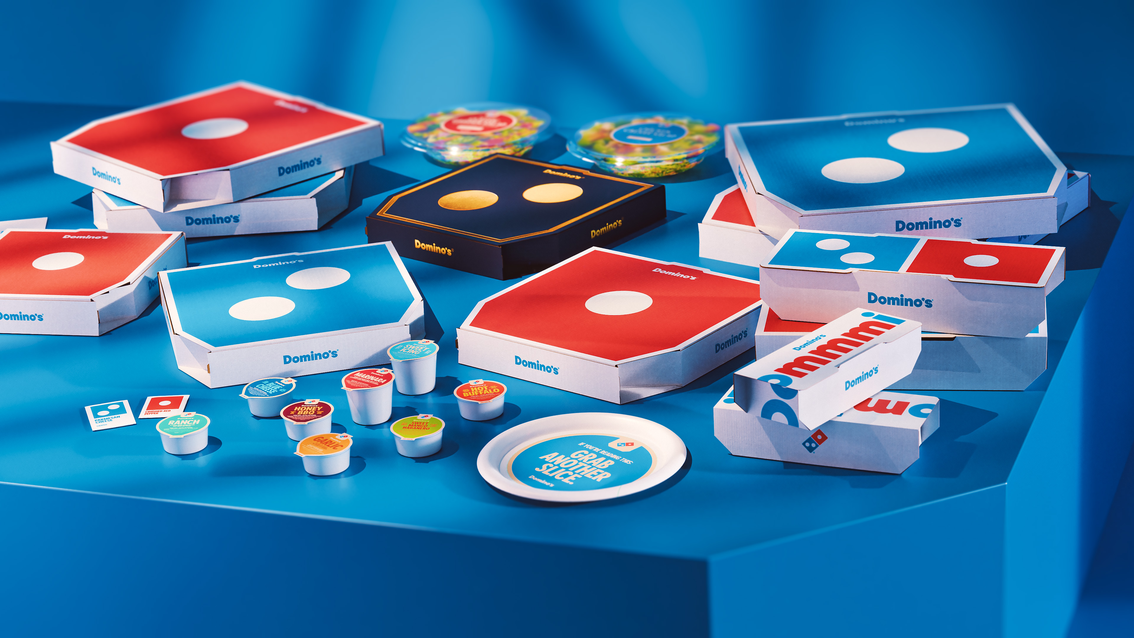

Perhaps most importantly, the entire packaging system was redesigned to function as a prop in our customers’ homes, in the thousands of social videos they create each day, and in the advertising we make too.
The Transformation
Uniforms
OOH
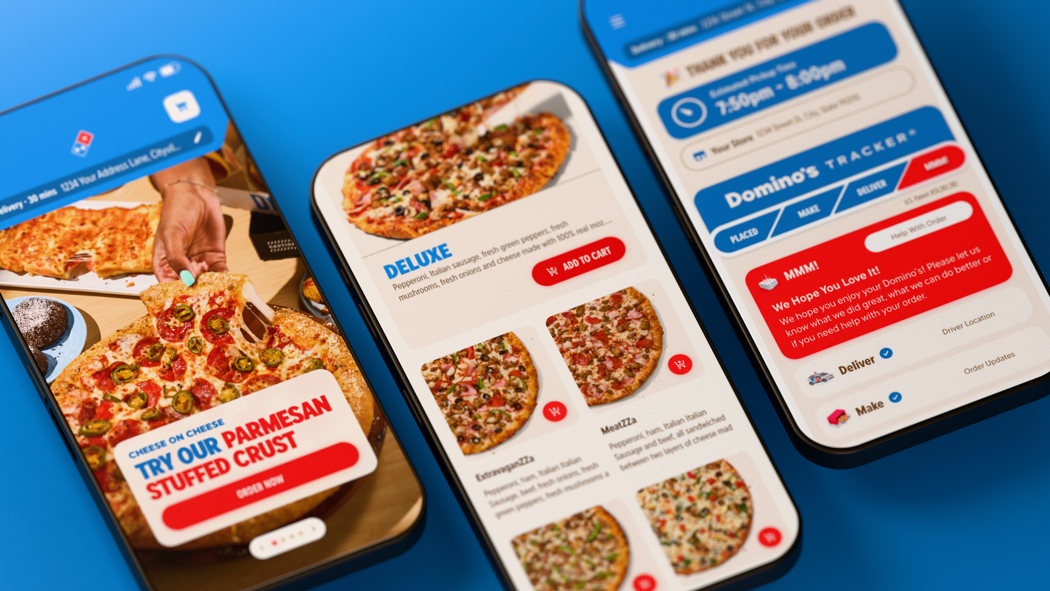
Ecommerce
Truck Wraps
Case Study
Results
Domino’s brand refresh struck a chord at a time when others were being ripped apart for theirs (ahem Cracker Barrell).
98.7%
Net Positive Sentiment
2K+
Media hits
3.6B
Total Reach
